

Creating an accessible experience for all
Prioritizing inclusion and accessibility is one important way we uphold our mission to build stronger communities.

A truely community-centric approach
When we think of community, we think of belongingness, compassion, and respect. Healthy communities celebrate people of all shapes, sizes, colors, and abilities. They never overlook, never exclude, never alienate.
Community is an extremely powerful force, and we strive to lead by example. We prioritize inclusion and accessibility as a design principle because you are a valued member of our community. We are committed to delivering a delightful experience, regardless of the abilities you do or don’t have.
It is important to us that you know you belong here.
Circa x EqualWeb
We installed EqualWeb to fill any accessibility gaps on our website.
EqualWeb is the world’s leading digital accessibility development company. It can take any website and make it highly accessible based on a user’s needs. Their solution is compliant with the Americans with Disabilities Act (ADA) guidelines and the Web Content Accessibility Guidelines (WCAG) and Success Criteria.
Click the EqualWeb widget in the bottom righthand corner of the screen to try it out.


Color Us
Committed
Our designers created a color palette that is both beautiful and functional. Over 8% of the U.S. population has some degree of visual impairment, and we are 800% committed to those members of our community!
Our palette meets strict contrast requirements that ensure all essential information can be seen and understood as clearly as possible.
What we do


Colors that have a contrast ratio of at least 4.5:1 and are clearly legible to everyone.
What we avoid


Colors have a contrast ratio less than 4.5:1 and are not clear for those with visual impairment.
Language
Matters

We intentionally employ simplistic vocabulary and syntax to articulate critical material across our tech stack.
Did that make any sense? Of course not! We use plain English to explain information.
speak a language other than English at home.
1 in 5
0 in 5
want to struggle to figure out what their app is trying to say.
Click here to learn more about the benefits of plain language. For more on our approach to language, click here.
Reading
Our Signals
Beyond words and simple shapes, we use additional design effects to guide users when using the Circa app.
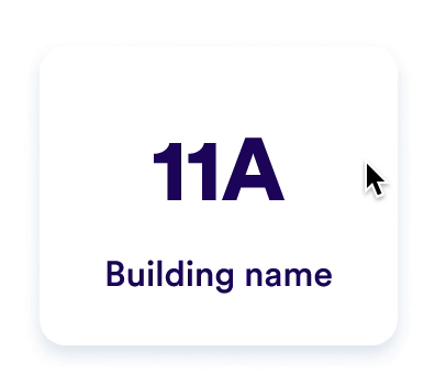
Pressed state
When a user clicks an object (like the tile above), both the object and the shadow behind it shrink slightly. This gives the user the impression they are pushing down a 3D object. This small effect is an additional confirmation that improves accessibility and gives a more interactive experience for all.

Selected state
When a user lifts off an object (thereby selecting it), we outline the object in a thick stroke using an accessible brand color. This is an additional way to communicate to the user their choice and/or action.

What is WCAG?
The World Wide Web Consortium’s (W3C) Web Content Accessibility Guidelines (WCAG 2.1) is an extensive set of design rules explaining how best to accommodate a wide range of disabilities within web and app user interface design.
In keeping with best practices, our design team is striving for 100% WCAG 2.1 Level AA compliance, which W3C endorses as its “decisive recommendation.” We are thrilled to report that we are nearly there! Our longer-term goal is to achieve Level AAA compliance.

Our effort is ongoing
We are continually revising our products to ensure compliance with WCAG guidelines.
Specifically, we are working to improve keyboard-only controls and visual accessibility of all non-essential design graphics. We also have plans to make Circa available in additional languages, starting with Spanish.
If you are facing an issue or have ideas on how we can provide a more accessible experience, please let us know by completing the below form.